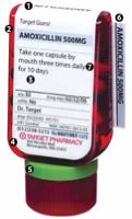
How do you build a better pill bottle? Target commissioned designers to do just that, and according to this article on New York Metro, this is how they did it (number below correspond to the number on the bottle):
- Easy I.D. — The name of the drug is printed on the top of the bottle, so it’s visible if kept in a drawer.
- Code red — A universal symbol for caution (and Target’s signature color, of course).
- Information hierarchy — divide the label into primary and secondary positions, separated by a horizontal line. The most important information (drug name, dosage, intake instructions) is placed above the line, and less important data (quantity, expiration date, doctor’s name) is positioned below.
- Upside down to save paper — An upside-down label that stands on its cap, so that the label can be wrapped around the top. Every piece of paper in the package adds up to one eight-and-a-half-by-fourteen-inch perforated sheet, which eliminates waste and makes life easier for pharmacists.
- Green is for Grandma — A system of six colored rubber rings that attach to the neck of the bottle. Family members choose their own identifying shade, so medications in a shared bathroom will never get mixed up.
- An info card that’s hard to lose — A card with more detailed information on a drug (common uses, side effects) is now tucked behind the label. A separate, expanded patient-education sheet comes with three holes so it can be saved in a binder for reference.
- Take “daily.” — Avoided using the word “once” on the label, since it means eleven in Spanish.
- Clear warnings — Revamped the 25 most important.
At the end of the project, and the end of the list above, it’s clear that the designers have really revamped a whole lot of the consumer side of the prescription process. Will this be a differentiating factor for Target? Maybe. I don’t know if it will be for me. But then I think about all the people out there that have to take lots of pills on a daily basis; I bet this will be a huge deal for them — everything else (read “price”) being equal, if I took lots of pills, I’d probably go to Target just to get all of the features listed above.
Did anyone know that they wanted a new pill bottle? Nope. And that’s what makes this so cool; a perfect example of building a better mousetrap. Simply put with the title of this post on Seth Godin’s blog: “Target Gets Remarkable.”
These bottles will be available at Target pharmacies on May 1.
All of this originally started with this post on Boing Boing.
No comments:
Post a Comment